
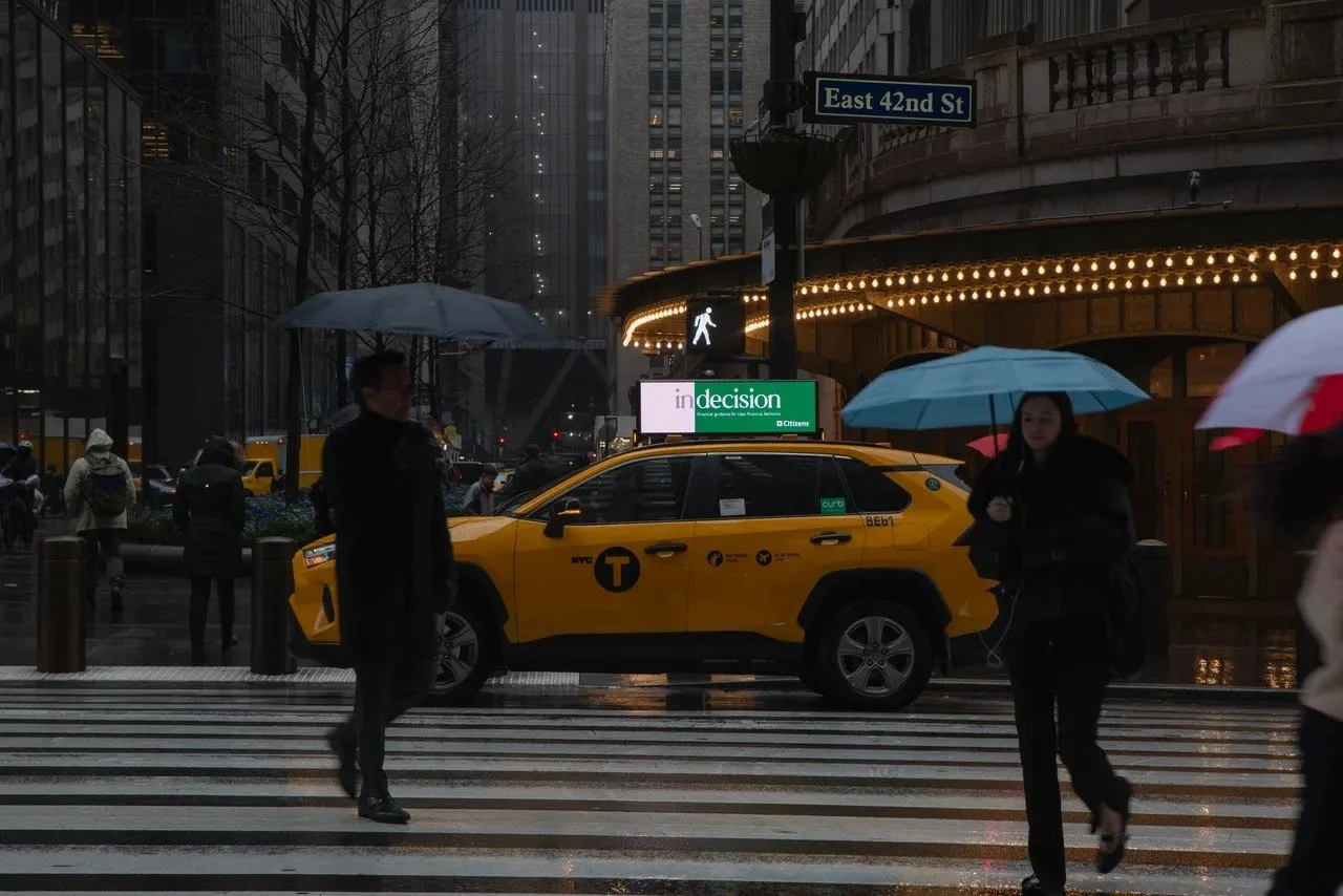
NYC taxi advertising turns every cab into a moving billboard across the five boroughs.
Designing a NYC taxi ad means designing for a moving canvas seen in seconds: radical simplicity, high contrast, one clear message, and a logo that reads at a glance. You (or your agency) create the artwork; your media partner supplies the exact spec sheet, templates, and safe zones for each format so it produces cleanly and runs on the street.
Taxi ads aren't billboards. They're seen at various speeds, angles, and distances, so every element must earn its place. This guide covers the design principles, file specs, and production steps that make a NYC taxi campaign land.
The core principle: radical simplicity
Your audience has a few seconds to see, process, and understand your message before the taxi disappears into traffic. This type of high-impact transit advertising demands a different approach than static media.
Focus on a single, compelling idea. Can you communicate your core value in seven words or fewer? If not, it's too complex. The street is cluttered with competing visuals, so your design needs a strong visual hierarchy: the eye should land first on the most important element — usually the brand name or a hero image — then the brief message. Make it intuitive and instantaneous.
Contrast and legibility
High contrast is non-negotiable. A design that looks great on a 27-inch monitor can become an illegible blur on the side of a moving cab. Test by viewing from a distance and squinting — if the core elements don't stand out, the contrast is too low. Think bold color blocking and simple shapes: black on white, white on black, or a bright color against a dark neutral. Avoid subtle gradients and low-contrast text. The ad will be seen in bright daylight, under streetlights, and in the rain, so it must stay visible in all conditions.
Typography and sizing
Text that's too small is the most common and costly design mistake. Firefly's own rule of thumb: take a five-second look at your design from about 15 feet away — just like your audience sees it on the street — and check the message is still loud and clear. If your design needs more than one typeface, keep the pairing simple and high-contrast — for example a black weight of a sans-serif for the headline with a medium weight of the same family for the sub-text (Montserrat Black + Montserrat Medium). Avoid clashing two complex fonts; the goal is a cohesive, digestible message.
Logos and brand assets
Use your existing brand logo — there's no need to redesign it for the medium. The job is placement, not reinvention: give the logo a clear corner, keep enough clear space around it, and make sure it reads at a glance without crowding the headline. Brands run their normal identity on taxi tops every day — you supply your standard logo files and the format does the rest.
When a campaign involves multiple sponsors (say, a major event), avoid "logo soup." Establish a hierarchy: the primary sponsor's logo largest and most prominent, secondary partners smaller and grouped, each keeping its own clear space. A clean, organized layout reads as a professional partnership.
Safe zones and clear space
Every format — digital toppers to side panels — has a "safe zone": the central area where critical elements like your logo and headline must sit to avoid being cut off by the vehicle's hardware or trim. Your media partner provides templates that mark these zones for each ad unit, along with the clear space to maintain around your logo. Designing inside the safe zone from the start avoids reprints and rejected creative.
Formats and what they're good for
Digital taxi toppers: high-resolution rooftop screens with the most creative flexibility — full-motion video (where permitted), animated graphics, or multiple cycling messages. Ideal for time-sensitive offers and dynamic content, with creative changed remotely for A/B testing and measurement and attribution.
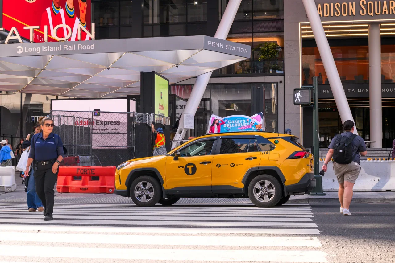
Static toppers: printed rooftop panels offering reach and frequency above the eyeline of traffic — best for bold, simple branding over a longer flight.
Interior Taxi TV: in-cab screens with high dwell time, suited to more detailed messaging and direct calls to action for a captive passenger.
File specifications and artwork handoff
Incorrect file specs are the number-one cause of production delays. Every provider has precise requirements for resolution, color mode, and format; adhering to them from the start saves time and ensures the final product looks as intended. Your partner supplies a detailed spec sheet for each advertising solution.
File specs by format (NYC)
| Format | Build to (pixels) | File | Notes |
|---|---|---|---|
| Digital taxi top — static |
560 × 160 NYC: 1920 × 674 |
PNG RGB 72 PPI Max 3 MB |
Content displays simultaneously on both sides of the digital top. |
| Digital taxi top — video |
560 × 160 NYC: 1920 × 674 |
MP4 29.974 fps 8 sec Max 5 MB |
Optimized for an 8-second playback loop. |
| Interior Taxi TV — video |
Minimum 1280 × 720 (16:9) |
MP4 / MOV / WMV Bitrate ≥ 1,200 kbps |
Optional vertical action banner: 120 × 450 px Max 100 KB |
Digital screens are built in RGB. Keep the message to seven words or fewer — the top is optimized for an 8-second display. Submit creative to creativestudio@fireflyon.com, finalized at least 3 business days before launch (5 business days for Taxi TV). Printed static-top artwork specs are provided by Firefly's creative studio on request — ask for the exact dimensions rather than assuming a resolution.
Why this matters: digital screens render in RGB (light), so build files in RGB, not CMYK. Match the exact pixel dimensions above so nothing scales or blurs, keep video to the required length in whole seconds, and stay under the file-size cap — incorrect specs are the number-one cause of production delays.
Final production handoff checklist
After the final mockup is approved, prepare the production-ready files with a last technical review against the spec sheet:
Color mode correct for the format (CMYK for print, RGB for digital).
Resolution / pixel dimensions match the spec sheet exactly.
Critical elements inside the safe zone; logo clear space respected.
Fonts outlined (print) and images embedded; no missing links.
File named clearly, e.g. `BrandName_CampaignName_Version_Date.pdf`.
Once the checklist is clear, the files go to production. Following these steps makes for a seamless process — and you can always contact the team for the right templates and guidance.
From concept to street: the design workflow
Once a concept is selected, develop it into a full-scale mockup on a realistic taxi template so stakeholders can see the artwork in context. Viewing the mockup from a distance for only a few seconds simulates a real-world encounter — the moment to gather feedback and revisions. For digital campaigns, this is also where you plan A/B variations. All key stakeholders should sign off on the mockup before production.
Frequently asked questions
How do I submit artwork for a NYC taxi ad?
Send final, production-ready files to Firefly's creative studio (creativestudio@fireflyon.com), finalized at least three business days before launch (five for Taxi TV). Build digital files in RGB to the exact pixel dimensions for the format, keep video to the required length and file-size cap, and confirm the current spec sheet before exporting.
What size and format should NYC taxi ad files be?
For digital taxi tops, build to 560 × 160 px (NYC also requires a 1920 × 674 px version) in RGB: static art as PNG at 72 PPI up to 3 MB, or video as MP4 at 29.974 fps, 8 seconds, up to 5 MB. For interior Taxi TV, video runs at a minimum of 1280 × 720 px (16:9) at 1,200 kbps or higher. These are NYC specs — always confirm the latest with the creative studio, since they vary by market and hardware.
Can I wrap a whole NYC taxi for my campaign?
Not the yellow medallion cabs — TLC rules require them to remain taxi yellow, so exterior advertising runs on approved rooftop devices and interior screens rather than full-body wraps. Full wraps are an OOH format on other vehicle types and in other markets, but for NYC yellow taxis, design for the topper and interior formats.
Who designs the taxi ad — me or the media company?
You or your creative agency design the artwork. Your media partner provides the spec sheet, format templates, and safe-zone guides so it produces correctly, and offers dynamic-creative capabilities (live feeds, countdowns, animation) on digital tops — but the creative concept and design are yours.
What's the most common taxi ad design mistake?
Type that's too small and too many messages. Take a five-second look from about 15 feet away, lead with one dominant element, and keep to one clear call to action — a moving billboard is not a brochure.
How long should the message be?
Aim for seven words or fewer for the core message. The environment gives you only a few seconds, so a single idea with a strong visual hierarchy outperforms a dense layout every time.
Sources
1. NYC TLC — Approved Rooftop Advertising Rules — https://www.nyc.gov/assets/tlc/downloads/pdf/approved_rooftop_advertising_rules.pdf
2. NYC TLC — Taxicab Hack-Up & Maintenance Rules (Chapter 67, vehicle color) — https://www.nyc.gov/assets/tlc/downloads/pdf/rule_book_current_chapter_67.pdf
